These Hilariously Bad Graphs Are More Confusing Than Helpful

By

Updated Oct. 30 2018, 3:40 p.m. ET

display

We as a nation have an obsession with data points. They've seeped into our meetings, e-mails, and now even our daily news casts, pelting us with useless information and going out of their way to reference facts and statistics that will in no way ever impact how we decide to go about our daily lives.

I'm a visual learner, so I love a good graph. I find them to be the best way to simply get across a complicated idea. Well, most of the time I think that.

Sometimes the people who make graphs don't share my passion and end up making something that is just confusing. For example, don't use a pie graph to show progression. You are an adult. You should know that. 

I think seeing a bad graph is like seeing a dolphin on fire. I can't even imagine what events led here but I am still very angry and upset at the outcome. Don't need a graph to show that. 

Article continues below advertisement

I wonder if the person who made this will be going to college.

What?

Article continues below advertisement

So the hot is less hot than the cold? Okay.

Hmm.

Embedded Image
Article continues below advertisement

And people say college is pointless.

Embedded Image

Checks out.

Article continues below advertisement

Speaking of trash...

Embedded Image

How about some other colors?

Embedded Image
Article continues below advertisement

Again, how about other colors?

Seriously?

Article continues below advertisement

I know you were trying to make a tree here, but at what cost?

Embedded Image

Not all data needs graphs.

Embedded Image
Article continues below advertisement

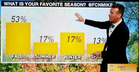
I see what you are doing, winter.

Someone just threw up on your graph.

Article continues below advertisement

How hard it is to make the line the right length? And why use a bar graph at all?

Don't print graphs on stairs.

Article continues below advertisement

Thanks for clearing that up.

You could have just written "everywhere."

Article continues below advertisement

Maybe don't use color if you can't print in color.

New York did poorly, I think.

Article continues below advertisement

Maybe make the graph bigger?

That is a lot of people.

Article continues below advertisement

Crazy how "not at all" is both the most and fewest.

The source is what bothers me the most here.

Article continues below advertisement

This would make more sense without the lines.

Can't tell if this is from a marketing meeting or a science textbook.

Article continues below advertisement

You know what shape would make the most sense?

That's it! I can't look at any more of these!

Advertisement

Latest Humor News and Updates

    Opt-out of personalized ads

    © Copyright 2024 Engrost, Inc. Distractify is a registered trademark. All Rights Reserved. People may receive compensation for some links to products and services on this website. Offers may be subject to change without notice.