These Unintentionally Confusing Signs Are Basically Riddles
Updated Oct. 3 2018, 5:43 p.m. ET
They say that good design is invisible. You probably don’t think twice when opening most doors, but if you’ve ever pushed when you should have pulled, you have careless design to thank. Likewise, you probably see dozens of unremarkable signs a day - signs that tell you where to go, where not to go, where to go to the bathroom, you get the picture - but once in a while, you might come across one that makes you do a double take.
Whether it's regrettable word placement, poor font choice, or ambiguous grammar, these signs hilariously fail to communicate.
1. This sign that appears to have an entirely different meaning when read from afar.
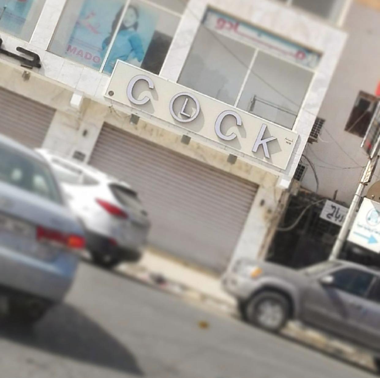
2. This clock store's attempt to get clever with it's signage.
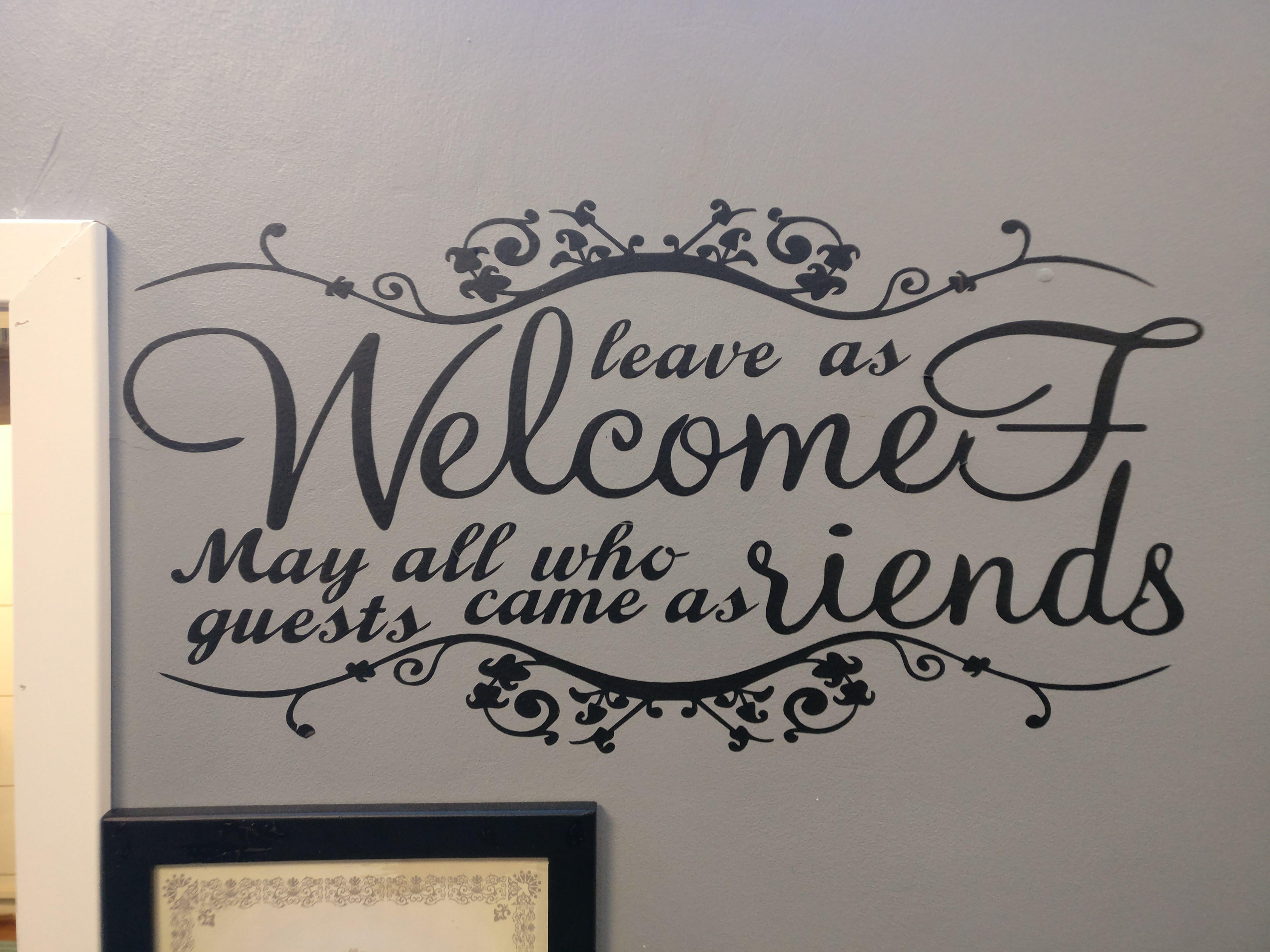
3. This cryptic welcome message that makes no sense even after descrambling.
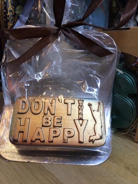
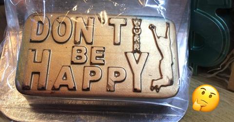
4. This knickknack that wishes misery upon you.
5. Okay this a shirt and technically not a sign, but boy is it sending a mixed message.
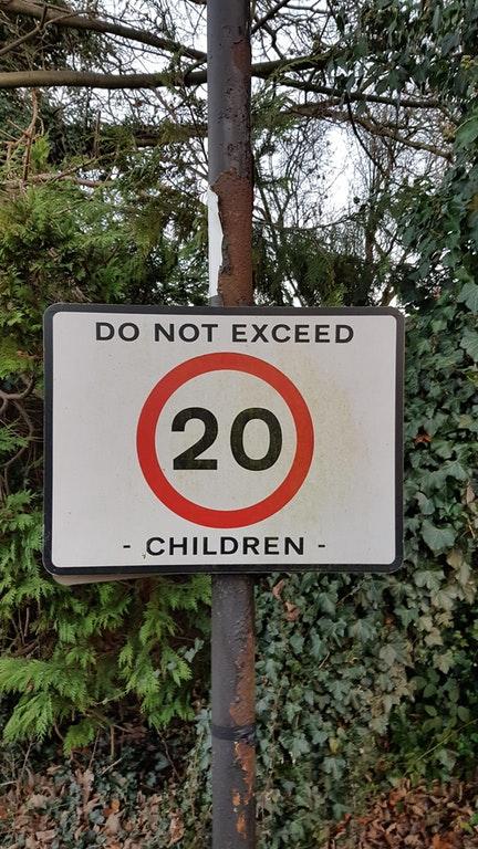
6. This speed limit sign that seems more concerned with overpopulation.
7. This 2nd birthday cake topper that becomes not-so-child-friendly from certain angles.
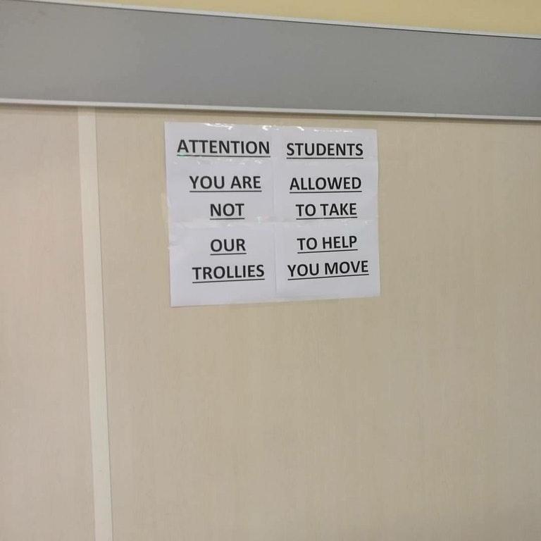
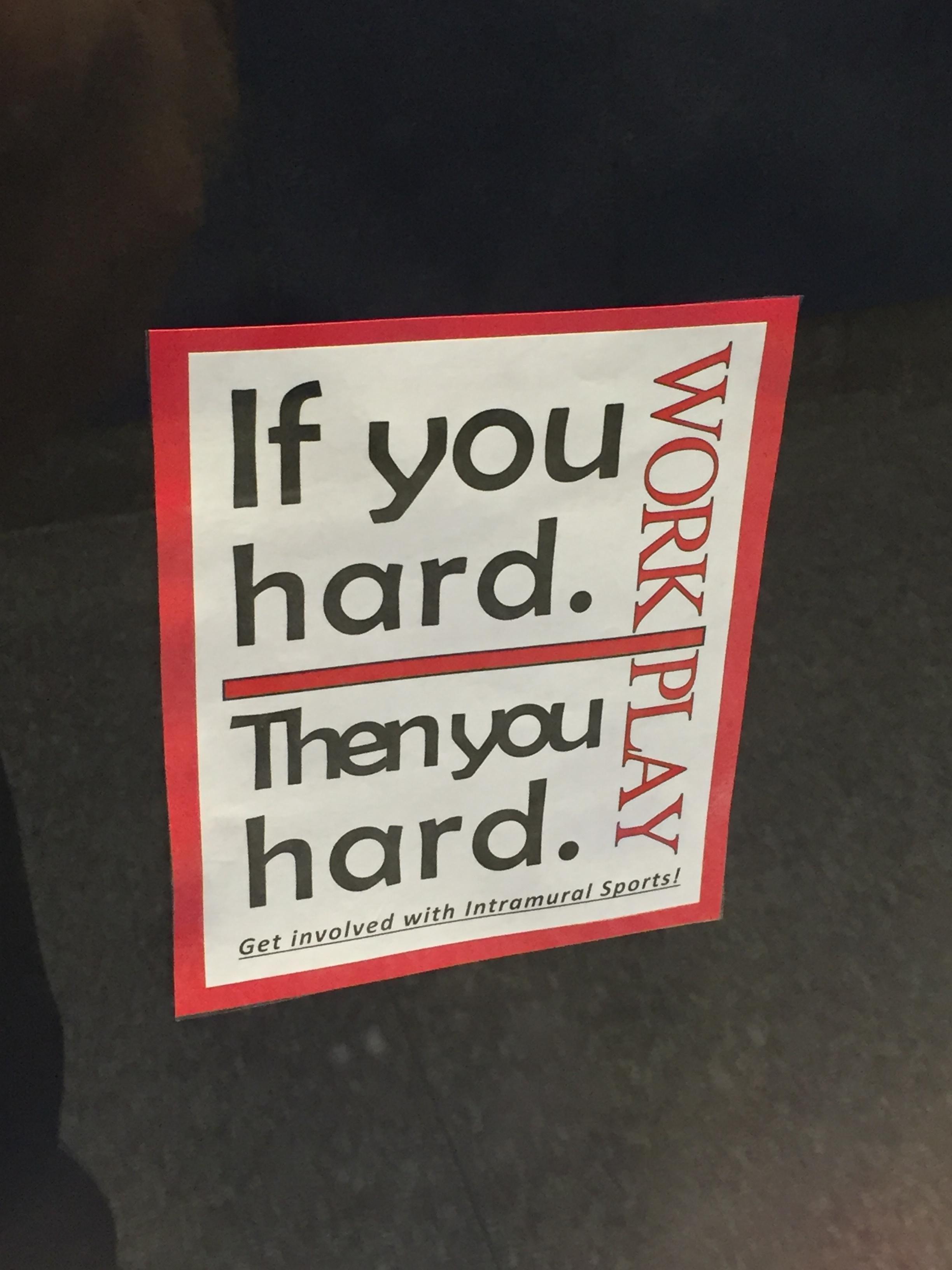
8. This campus bulletin that clarifies absolutely nothing.
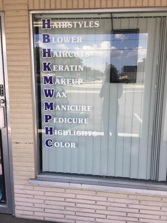
9. This window lettering that's clearly trying to waste your time by making you look for an acronym.
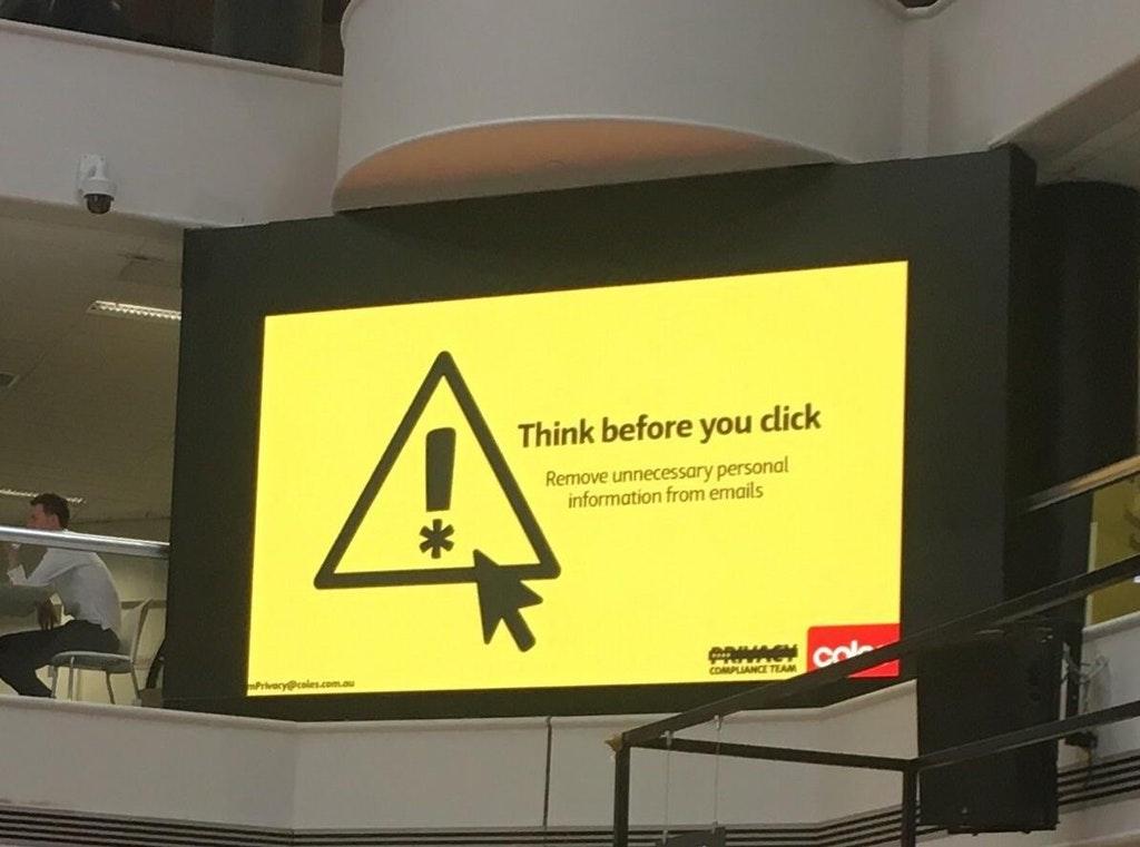
10. This sign which offers sound advice but probably could have used a change of font.
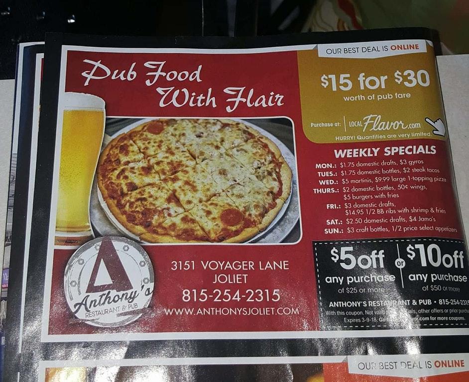
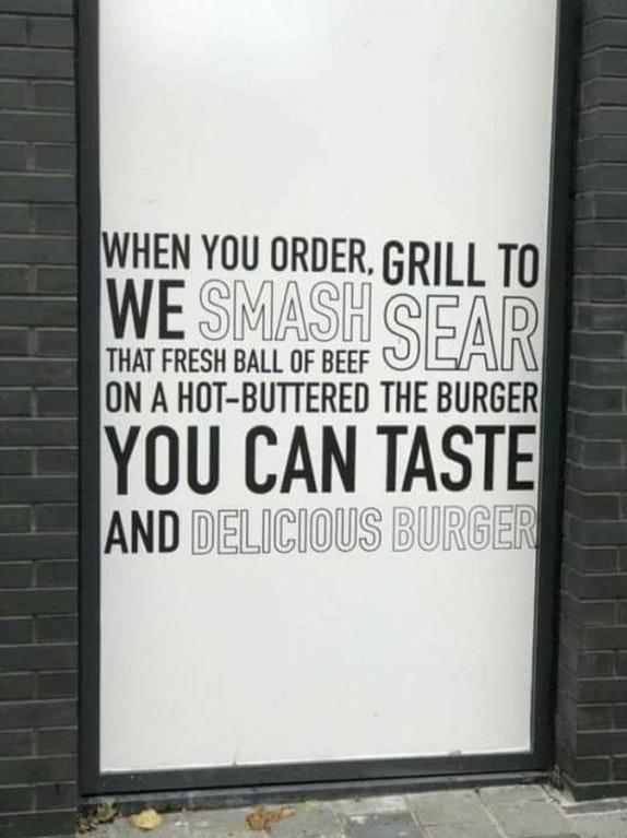
11. This unwittingly unappetizing restaurant ad.
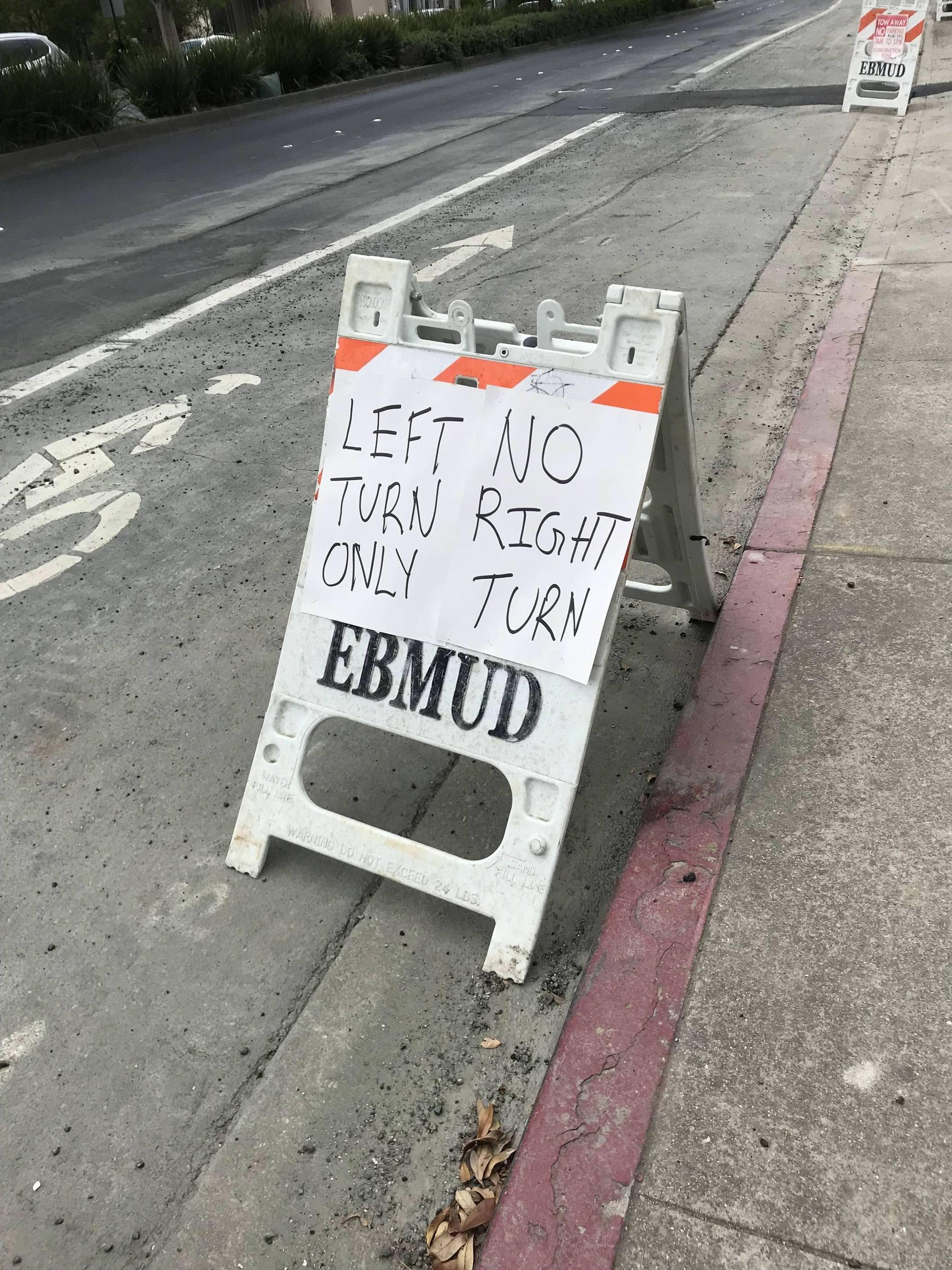
12. This sign meant to direct traffic that really just made things much worse.
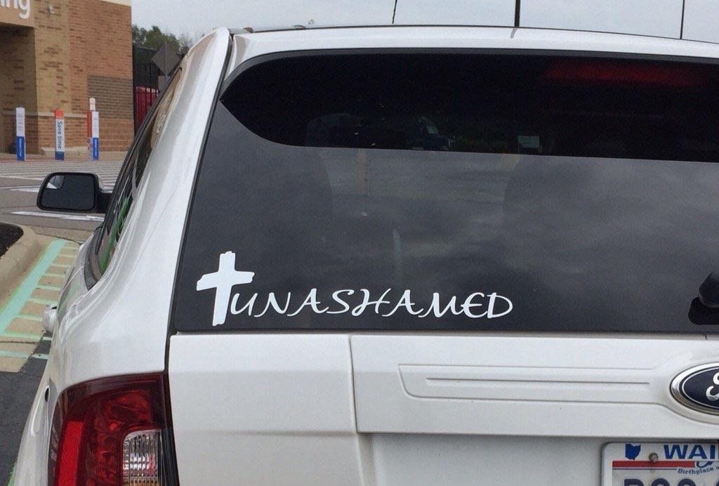
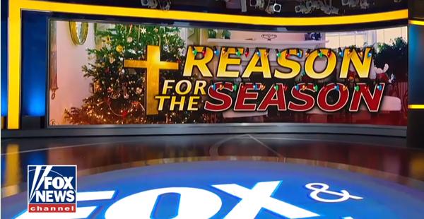
13. PSA: crosses look like Ts.
14. This one might actually be a freudian slip.
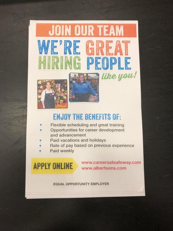
15. They might be "great hiring people," but they're not so great at designing flyers.
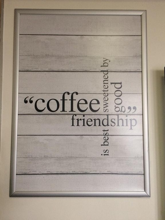
16. I should not have to turn my head into landscape mode just to read an "inspirational" quote.
17. Speaking of "unnecessary" quotation marks, they can really change the whole connotation of a sentence.
18. I mean, seems legit?
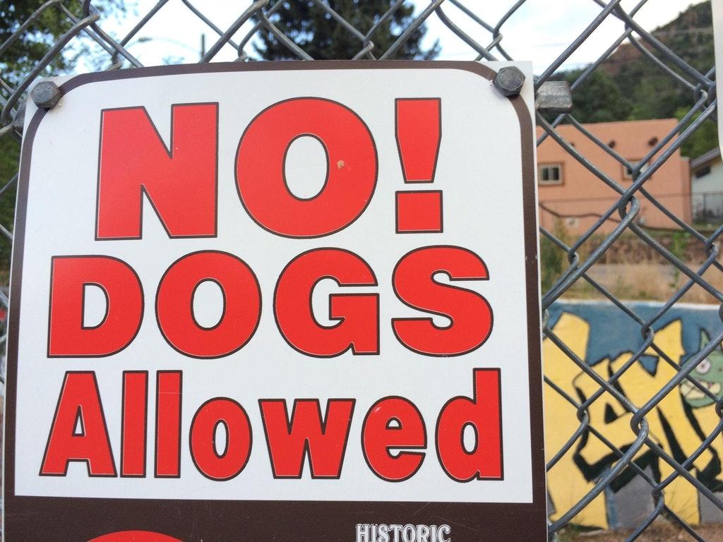
19. Sometimes misused punctation works in your favor though - I'm going to assume this sign is aggressively asserting that dogs are, in fact, allowed. Yay!
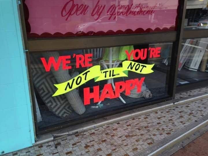
20. At least they got "we're" and "you're" correct.
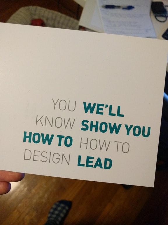
21. Well, technically they didn't claim THEY know how to design.
22. There's a lot going on here and none of it works.
23. Finally, if you can figure out what this is actually meant to say you are a certifiable genius.
Thank you, bad signage. You may have failed at your core purpose but you more than make up for it in entertainment value.

