Check out the Technology Behind TikTok’s Art History Faces Chart Trend
Published June 12 2021, 4:17 p.m. ET
You’ve seen TikTok users compare themselves to their celebrity “lookalikes.” You’ve seen them shapeshift into Marvel characters. And you’ve seen them use a filter to determine whether they’re “hot or not” — which, frankly, seems like a bad idea.
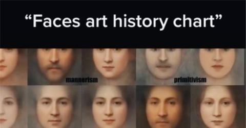
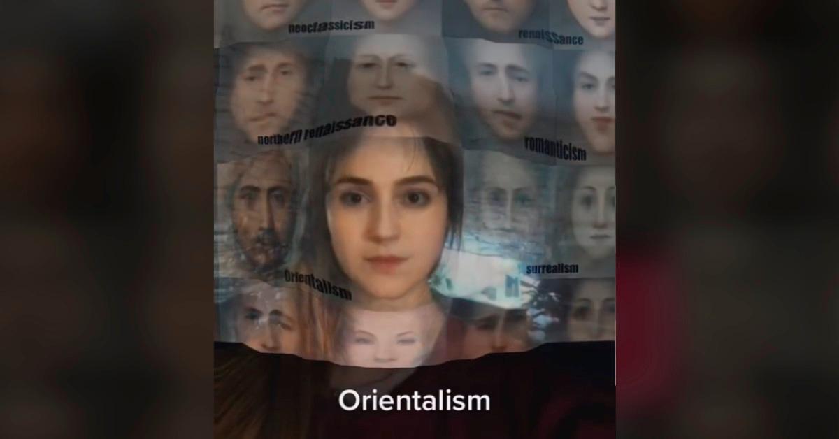
Now, however, TikTokers are using a chart of averaged faces from art history to see which of 18 historical art styles their faces resemble. The choices? Academism, Mannerism, Primitivism, Art Nouveau, Neoclassicism, Renaissance, Baroque, Northern Renaisance, Romanticism, Impressionism, Pop Art, Symbolism, Magic Realism, Post-Impressionism, or Ukiyo-e.
The art history chart on TikTok features 36 averaged faces from more than 18,000 portraits.
The chart was created by data analyst Aleksey Tikhonov, who detailed the making of the averaged images in a 2020 Medium post. Aleksey wrote that he started by culling around 18,500 portraits from the Painter by Numbers dataset of paintings.
“However, my attempts to build average faces by artistic style without additional data cleaning produced strange sexless faces,” he added. “Therefore, I had to break these portraits down into categories: group, male, female, child, and other portraits. The ‘other’ portraits were those where I wasn’t able to determine the character’s gender, e.g. some of the Cubist paintings.”
Aleksey then used the face detection, alignment, and averaging technology of John W. Miller’s Facer library, focusing on paintings from the 24 styles that had enough portraits for reference points.
In addition to the collage of averaged faces, Aleksey created a time-lapse video of portraits for every 50 years from 1500 to 2000 in 10-year increments. And he’s selling prints of each style’s averaged portraits on his Society6 page.
You don’t need an art history degree to know the differences between these styles.
If you’re not familiar with these styles — and don’t know your Nouveau from your Neoclassicism, for example — don’t fear. An Artland article describes many of the art movements depicted in the chart. The Baroque movement “emphasizes dramatic, exaggerated motion and clear, easily interpreted, detail … to produce drama, tension, exuberance, and grandeur,” Artland explains.
Impressionist artists, meanwhile, “attempted to accurately and objectively record visual ‘impressions’ by using small, thin, visible brushstrokes that coalesce to form a single scene and emphasize movement and the changing qualities of light,” according to the site. And Post-Impressionists “developed a personal, distinctive style although unified by their interest in expressing their emotional and psychological responses to the world through bold colors and expressive, often symbolic images.”
Of course, the face-averaging technology creates gauzy, vignette-like images that blur out the details, so you’d have to see images of individual works from each movement or — better yet — visit an art museum to see how brushstrokes, for example, differ between styles.
Redditors have scrutinized the chart, too.
Even if some of the finer points are averaged out, the faces in Aleksey’s chart have made a big splash on Reddit, where users have pointed out trends that transcend art movement.
“Does it seem like more female portraits are slightly askew to our left, like angled profile, vs. male portraits which are almost all straight on?” one user commented.
Another commenter wrote, “They all resemble the Mona Lisa. Maybe that’s why people like her face, because it’s an average of everybody. Da Vinci was ahead of his time.”

