'The Lion King' Deepfake Uses Original Movie To "Fix" Live Action Remake
Updated Aug. 12 2019, 8:59 a.m. ET
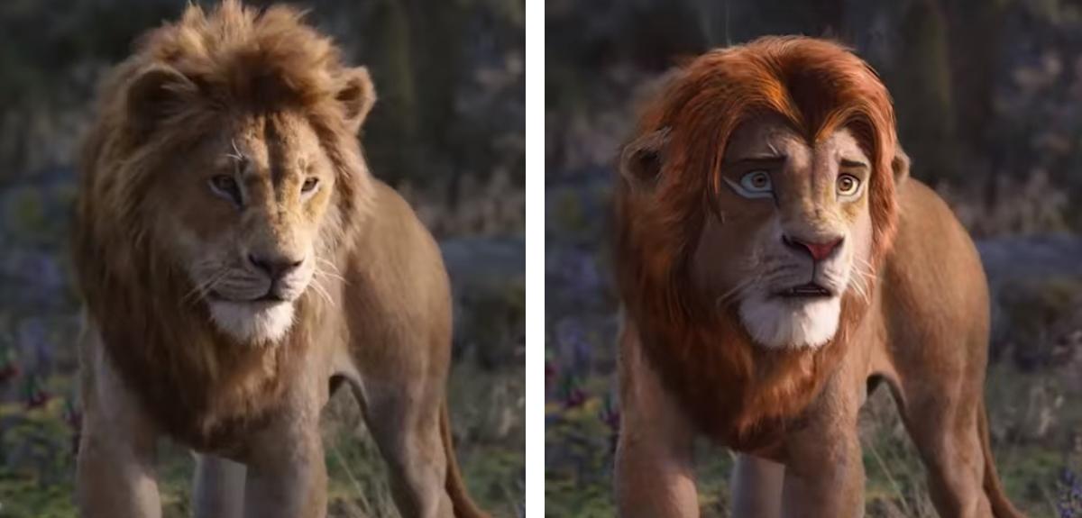
The Lion King's live-action remake has received its fair share of criticism online, with a common complaint being that the movie looks too real and more like a nature documentary when compared to the superb animation of the original.
While that hasn't stopped the film from dominating the box office, taking in nearly $500 million domestically as of the time of writing, it has led to a rather weak score of 52% from critics on Rotten Tomatoes. However, it is worth noting that the audience score is a far higher 88%.
"Where the animated original had an endearingly cheery anthropomorphism, with wide eyes and cute expressions, this lacks that," Claudia Puig of NPR writes. "You're marvelling at the beauty of the animals, but it just doesn't work with the material."
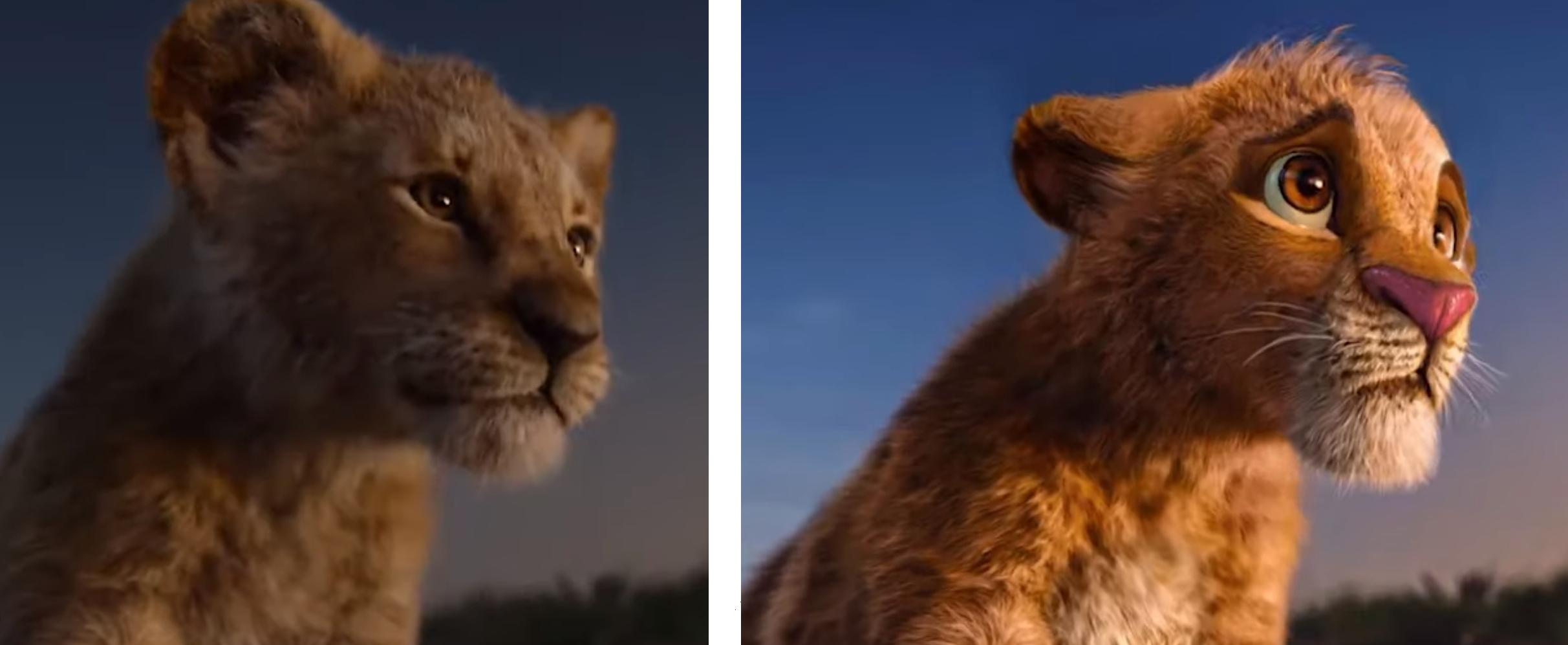
With that criticism in mind, some fans have taken it upon themselves to improve the aesthetic of the movie. YouTube user Jonty Pressinger decided to use deepfake AI to impose fan art of the original film—drawn by artist Nikolay Mochkin—onto the trailer for the live action remake. If you're unfamiliar with deepfakes, they're essentially incredibly intelligent computer programs that can impose video or images onto existing videos.
While the deepfake glitches out at certain points, it definitely provides a glimpse at what the movie could have looked like if Disney went with a style that was more consistent with the original. You can watch Pressinger's side-by-side comparison below.
Pressinger's version of The Lion King definitely has a very different look from Disney's remake. Just take a look at Simba...
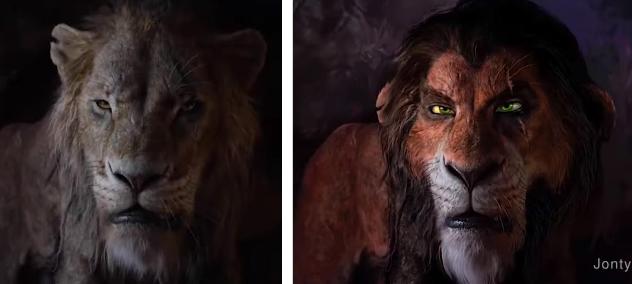
Disney's version of Scar drew criticism from many online before The Lion King was even released. The fan art by Nikolay Mochkin makes him look far more like the animated version in the original movie.
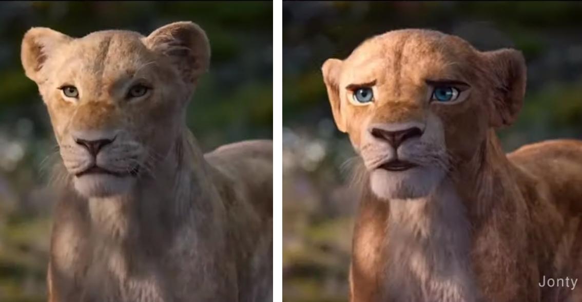
Adult Nala and Simba also look totally different.

As do Timon and Pumbaa.
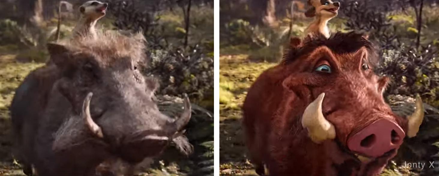
Fans of The Lion King definitely seem to be supportive of the new look. As of the time of the writing, Pressinger's video has over 1.6 million views and 15,000 likes compared to only 600 dislikes. Commentators also seemed to enjoy the more animated look.
"When fans produce a better version with no budget and getting more likes than the original," one user wrote. "Well deserved."
While another added: "Scar looks incredible. I would have been much more interested in this."
One commenter explained that they preferred this version because it portrays more emotion: "I don't get why they had to go for realism over "style" and emotion, this looks so much better to me. The characters just seem more unique and expressive."
What do you think of the style?