Why Did Streaming Service Max Change Its Logo From the Color Blue to Black?
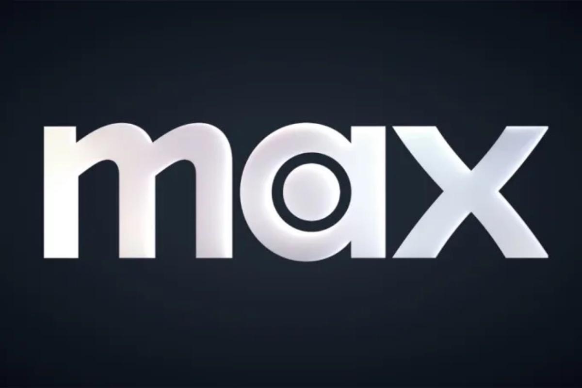
Max users were greeted with a noticeable change when they logged onto the streaming app, as the blue-and-white logo had changed to a black-and-white color palette.
Published April 1 2025, 11:26 a.m. ET

Companies are no stranger to making changes to their brand to keep things fresh and enticing for customers — and that’s exactly what’s happened with popular streaming service Max.
Just a few years after debuting its original logo, the streaming service, home to many of television’s biggest hits, surprised users who logged on to see a stark change from what they are used to.
Why did Max change from blue to black?
On Sunday, March 30, Max users were greeted with a noticeable change when they logged onto the streaming app, as the blue-and-white logo had changed to a black-and-white color palette that closely resembles the HBO logo, its sister service. This marks the third logo change for Max, which initially launched with a purple-and-white color palette before the change to blue in 2023.
Per Fast Company, Max reps said that the decision to change the color of the logo is part of a larger brand refresh set to take place. Additionally, the company says that while the standalone logo will be black-and-white, which will allow for flexibility of the logo in app and in marketing materials, the official change will be rolled out within the next few months.
What was behind the decision to change from the original to blue?
When the streaming service initially launched in 2020 under the name HBO Max, its logo was a vivid purple with white lettering.
However, that branding was ditched in favor of the recently dumped blue-and-white logo when HBO Max merged with Discovery Inc. (which was renamed Warner Bros. Discovery after being spun off by AT&T) in 2022 and the following year users were introduced to the blue branding, according to Variety.
Following that 2023 logo update previous global CMO Patrick Spagnoletto explained the decision to adopt the blue branding that many other streaming services also use.
“There’s different types of blue, and if you put us in juxtaposition to Disney or Paramount or Prime, they look different,” Spagnoletto said at the time, per the outlet.
“With our blue and the way that the logo is designed, what we were going for is a combination of premium but accessible. Consumers will tell us if we got it right, and we think we did. But there’s enough room in the world of blue to still differentiate ourselves,” he added.
It appears that with the latest change, Max is listening to users’ previous gripes that Max should mirror the HBO logo since it is the cable service’s streaming platform and users will be able to directly connect the two.