The Steelers Only Have One Logo on Their Helmets — Here's Why They Made the Unusual Choice
Art Rooney wasn't quite sure if he would like the logo against the gold of the helmets, so he ordered the logo stamped on only one side.
Published Oct. 21 2024, 4:28 p.m. ET

In the NFL, logos are a big deal. Every team has their identity, and fans can be rabid about refusing to allow things to change. Nearly every team in the NFL stamps their logos all over every uniform item, including two logos on each helmet. Except for one team.
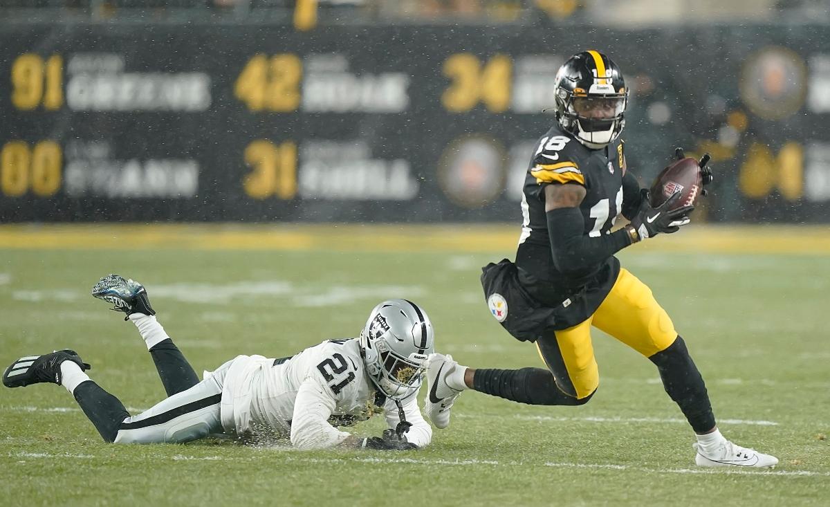
Famously, the Pittsburgh Steelers only have one logo stamped on their player helmets. But why? It's an unusual omission that fans often wonder about, considering the fact that team recognition at a glance is such an important part of uniform branding. Of course, the fact that the Steelers helmets have a void is as recognizable as a second logo would be, but nonetheless, it's an odd choice. Here's why the helmets are displayed the way they are.
Why do the Steelers only have one logo on their helmets?
Back in the 1950s, NFL teams were just beginning to use helmets. At first, the Steelers stamped player numbers on either side of their helmets like most of their contemporaries. Eventually, as helmets began to evolve, the Steelers adopted more stylized helmets with logos. In 1962, U.S. Steel offered the Steelers logo for the NFL team to use.
Also in 1962, franchise founder Art Rooney Sr. ordered gold helmets. He wasn't quite sure if he would like the logo against the gold of the helmets, so he ordered the logo stamped on only one side. Not only did he end up liking how the logo looked, but the '62 Steelers finished their year 9-5 and became the winningest team in the franchise's history, which cemented the single logo's good fortune and place on the team.
Although they liked the logo enough to keep it, they never added it to the other side. It was simply a temporary measure that took on a life of its own. NFL owners can be a little superstitious, so it's likely that Art didn't want to mess with a good thing once they had it going.
The history of the Steelmark is America's history in some ways.
NFL logos are deeply tied to American history. Most have changed through the years, and they've always changed with the times to mark a moment in history.
The Steelers' logo hearkens back to an industrial boom in the United States when the team's home city of Pittsburgh was one of the most important in the country. The symbol was originally known as the Steelmark logo, belonging to the American Iron and Steel Institute (AISI). The United States Steel Corporation (U.S. Steel) created the logo. It contains three hypocycloids, which are the diamond shapes contained in the logo, along with the word "Steelers."
Each hypocycloid has a meaning, according to U.S. Steel: that steel lightens your work, brightens your leisure, and widens your world. Additionally, the colors stand for the three materials which come together to produce steel. Yellow represents coal, orange represents iron ore, and blue represents steel scrap.
Like other NFL teams, the logo means more than just a brand to stamp on uniforms. It represents the spirit of that team, and the city they call home. More often than not, the logos tell a story of their home cities and recall how American history has intertwined with the NFL throughout the decades.