AOL's App is Yellow Now, Leading Some to Wonder Why They Made the Change
AOL's color change might be designed to remind you of an older logo.
Published March 18 2025, 2:17 p.m. ET

The apps on your phone are meant to be things that you rely on every day, and that's more true of your email app than almost any other. That's why, when an app changes its design or color scheme, it can be so jarring for users, with some people even wondering if the app disappeared altogether.
Recently, users of the AOL app noticed that the app was now yellow instead of blue, and wondered why they decided to change the color scheme. Here's what we know.
Why is AOL yellow now?
We don't have a solid explanation as to why the AOL app is suddenly yellow, but it seems to have been a conscious decision that the people who run the app made. The app was previously blue, which is one of the more common colors for smartphone apps.
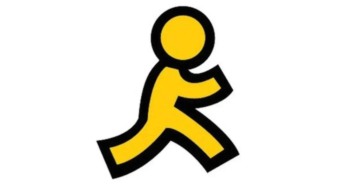
Although we don't know exactly what motivated the color transformation, it may have been designed to evoke the iconic "yellow running man" that defined AOL through much of its heyday.
That running man logo was officially retired in 2017 but was an important part of the early internet experience for many users.
In 2014, The Atlantic spoke to JoRoan Lazaro, creative director at The Martin Agency in New York, who designed the logo for AOL in the mid-90s. At the time, it became one of the most important logos in the history of the internet, right next to that apple with a single bite taken out.
"The [running man] design came about because I was spending a lot of time looking at 1940s and '50s postwar American logos and trademarks. If you go back to '40s and '50s logos and trademarks, you'll see that there's actually quite a few men that were used—a silhouette that either had curved legs or angular legs and a round head, in addition to the ones that looked quite a bit more stylized or looked really, really human. The running man was really inspired by those," he explained at the time.
While there are plenty of people who remember that running man logo with fondness, there are also plenty of people who are not super happy about the color change. The yellow certainly stands out, and that's not a good thing for some.
"Ewww….why did AOL make their app yellow instead of blue?!" one person wrote on Twitter.
"The nerve of @AOL changing their app from blue to that ugly ass yellow. Delete," another person added.
While we don't know for sure what spurred AOL's decision to change the color of the app, it doesn't seem like it's gone over well with at least some of their customers. Of course, as is the case with all design changes of this kind, it sometimes just takes time for you to adjust to the new design. In three years, if they decide to change the color to green, it may spark a similar level of revolt because everyone will now remember the yellow fondly.