This Person's Detailed Analysis Of The Cheesecake Factory Will Make Your Head Spin
Updated Dec. 3 2020, 2:05 p.m. ET
If you've been to The Cheesecake Factory, you've probably wondered, "What the heck is going on in here?" for a couple second before diving into a slice of cheesecake and forgetting about it. It's a very strange decor for one. It seems like it's transitioning between an early 2000s chain restaurant and a hip, trendy place you'd see popping up somewhere in Brooklyn. Not to mention the awkward placements of some of the doors. If you haven't noticed -- most locations have TWO entries one by the slice counter (where the actual hostess desk is) and then one main entrance that cuts across the dining room. Seriously whats up with that? Truthfully though you've probably never really sat there to think long and hard about what's actually going on at The Cheesecake Factory from a design standpoint.
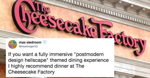
Luckily Twitter user @MaxKriegerVG could not forget. In an incredible thread, they outlined everything that's not quite right about the chain eatery, and the level of detail in their analysis will make it impossible for you to ever look the same way at a Cheesecake Factory ever again.
In fact this might inspire you to make a visit to yourself to indulge in 2500 calorie cheesecake while marveling at the seriously questionable choices the company has made with designs. He gets seriously in depth with this analysis:
So basically a visit to the Cheesecake Factory is a visit to a restaurant which isn't sure if it wants to be Outback Steakhouse or a high end luxury dining experience. It's like the two got married and had a kid. Truly bizarre.
This thread blew up, because it rang so true for readers:
The Cheesecake Factory is America.
