These Confusing Design Decisions Will Anger The Most Die-Hard Apple Fans
Updated Oct. 7 2018, 9:19 p.m. ET
There's no denying that Apple products are some of the more desirable ones on the market. iPhones, iPads, iMacs, Macbooks, pretty much all of their products have some of the highest resale values in the tech world because they're in such high demand.
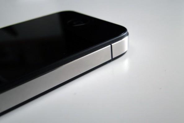
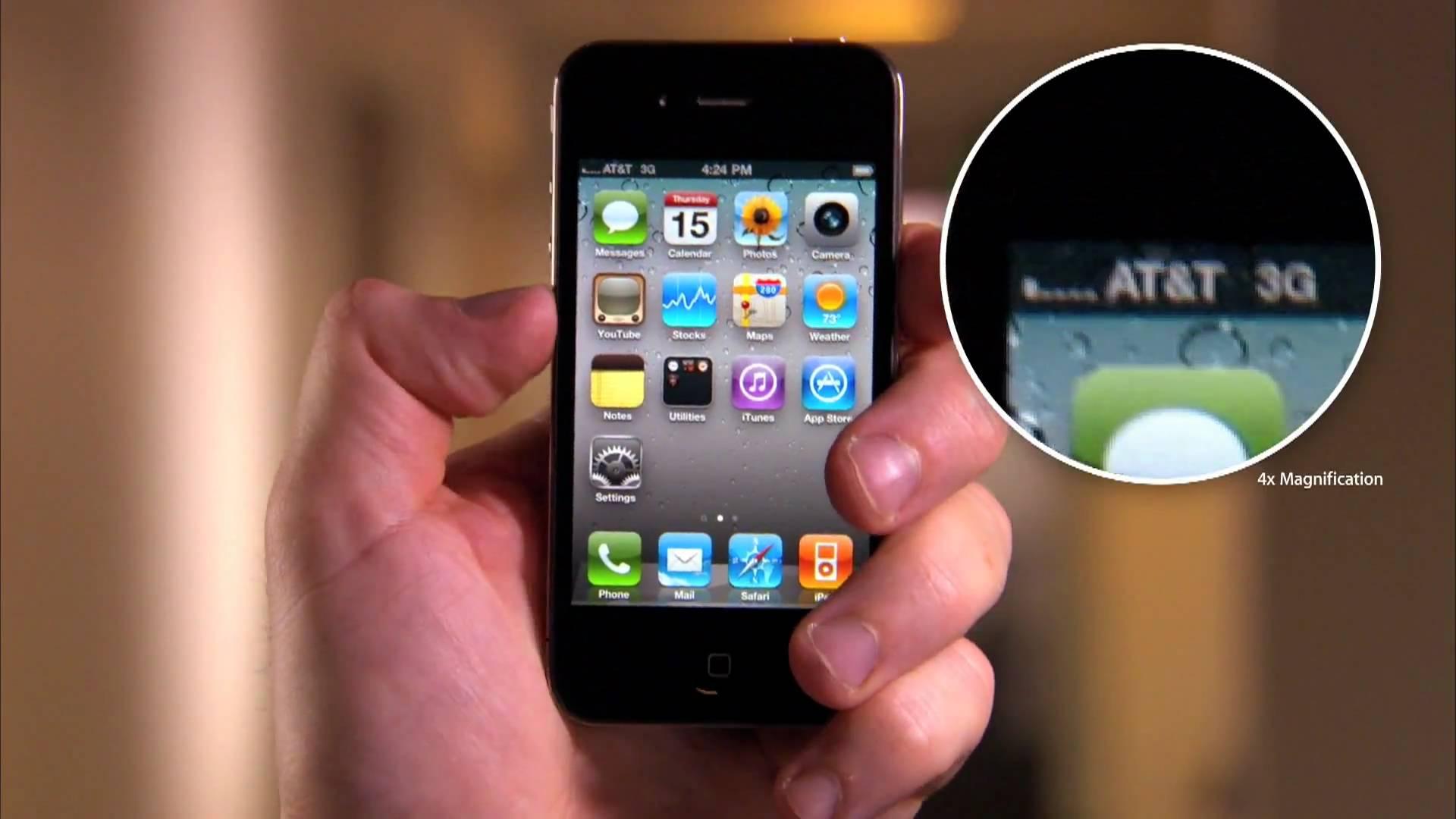
A lot of that has to do with just how sleek they are. Remember when the iPhone 4 was first announced? It was a thing of beauty. Super slim, glossy, gorgeous, compact, and just plain sexy.
Seriously, it was revolutionary.
But some of those sleek designs come at a price.
For example, when Apple released the gorgeous iPhone 4, it turns out its engineers messed up and placed the phones antennas in a less-than-ideal spot. So if you held your phone a certain way, your service would drop and you wouldn't be able to use your iPhone as a...phone.
That's not where the weird design choices end, either.
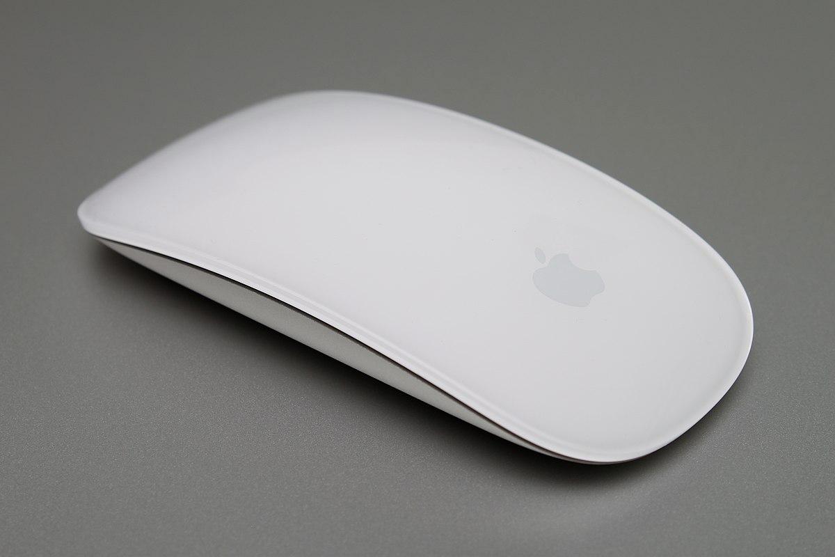
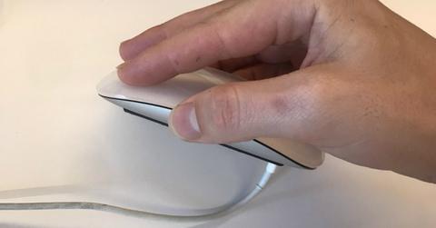
Ever use Apple's rechargeable, matte-and-glossed out magic mouse?
It's a great little gadget and you feel like you're navigating the mainframe of the starship enterprise while you're browsing memes or logging into Facebook. Plus, the thing's wireless, which makes the whole thing even sleeker.
Guess where they put the charging port? Definitely not in a spot that would spoil the mouse's good looks, right? So put it on the bottom, no problem, right? Well, actually, it's a big problem for anyone who's trying to use the device while it's charging, because look.
It would be like preventing a laptop from charging unless it's entirely closed.
And as it turns out, tons of people have a problem with this awful design.
Some believe that the poor design is intentional.
While others are just flabbergasted.
Others put the onus on the customer, saying that if you can't have the foresight to charge your mouse when you're not using your computer, then it's your own fault.
But some weren't so quick to come up with excuses for Apple's design team.
Others found a way around the inconvenience.
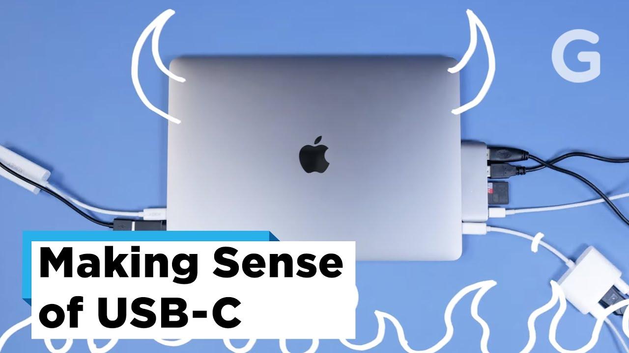
Since Apple is pushing the envelope it terms of design by being reductive in many ways, it's going to inevitably lead to some cross-usability issues between devices of the same generation or "line-up." Like users who purchased new Macbooks that removed all normal-sized USB ports in favor of 4 USB-C connectors. Some users were so flustered by it that Gizmodo made a video on how to cope with the new laptop's lack of connectivity ports.
Designing a laptop that can't be connected to any of your existing phone models without an adapter is pretty annoying, but apparently that's going to be taken care of as it looks like Apple's lightning adapters will become a thing of the past.
And there are probably a lot of people happy that lightning cables will no longer exist, seeing as they love breaking.
Like, constantly.
If you thought you're bad at taking care of cables, you're probably not the problem.
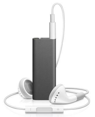
And while we're on the subject of questionable Apple designs, behold the iPod shuffle without buttons. This has to be one of the strangest designs in tech. Like, ever.
What are some of the most infuriating Apple product designs you've ever dealt with?
